Responsive Layout Behavior
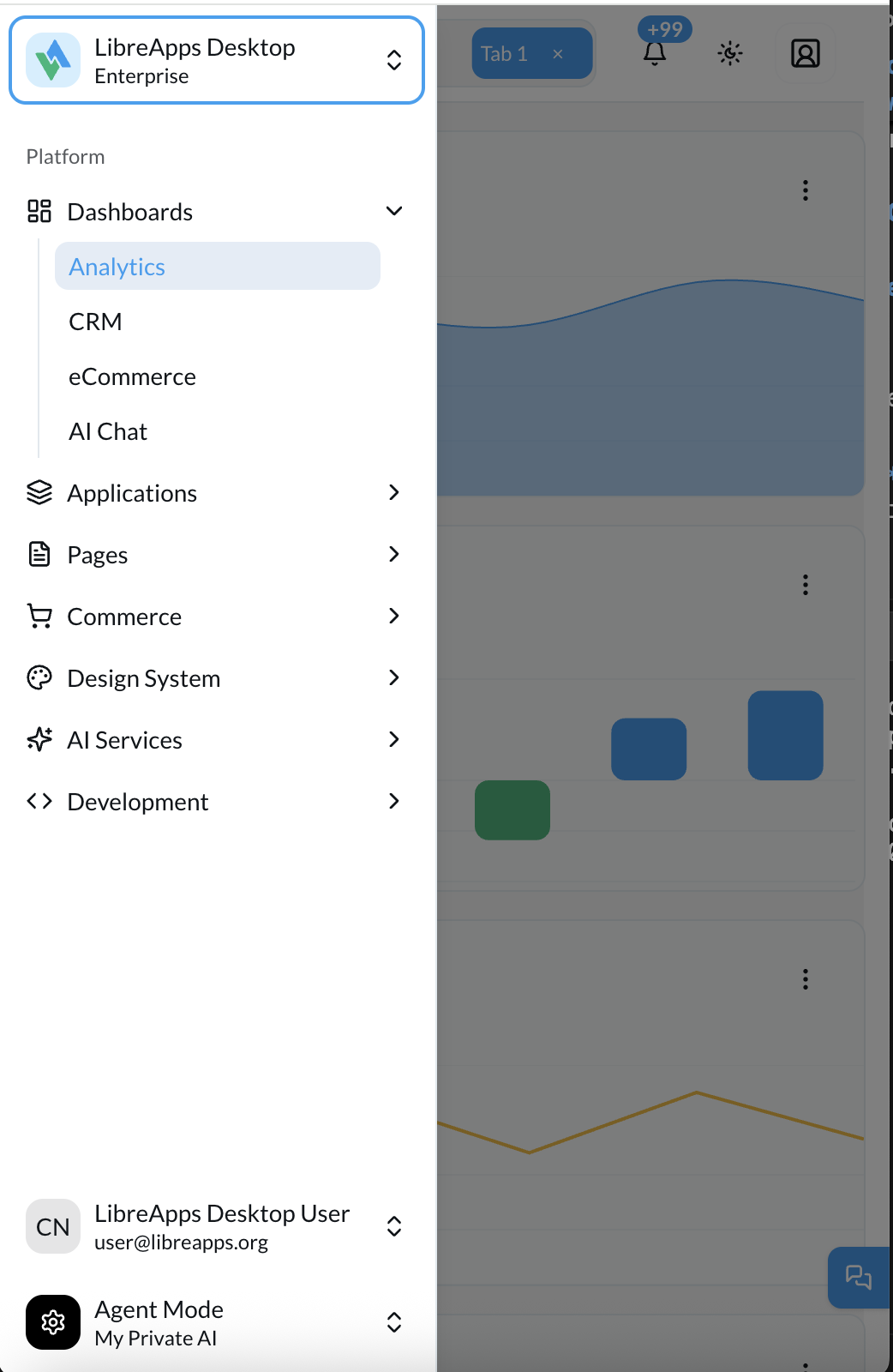
LibreApps Desktop implements a three-tier responsive sidebar system that adapts intelligently to different screen sizes, providing optimal user experience across desktop, tablet, and mobile devices.
Overview
The sidebar has three distinct modes that activate automatically based on viewport width:
| Mode | Screen Size | Behavior | Default State |
|---|---|---|---|
| Desktop | ≥1024px | Full sidebar with text labels Desktop toggle icon | Visible (expanded) |
| Tablet | 768px to 1023px | Mini icon sidebar No hamburger menu | Always visible (collapsed) |
| Mobile | <768px | Hamburger menu icon Hidden breadcrumb Full sidebar on toggle | Hidden until toggled |
Desktop Mode (≥1024px)
Default Behavior
- Full sidebar displaying icons + text labels
- Width:
16rem(256px) - User can manually toggle between expanded and collapsed states
- State persists via cookie storage
User Interactions
Click Toggle Button → Collapses to icon-only sidebar (3rem / 48px)
Click Toggle Again  → Expands back to full sidebar
Visual Characteristics
- ✅ All navigation text visible
- ✅ Expandable/collapsible groups
- ✅ Full menu labels and descriptions
- ✅ Smooth transition animations
Tablet Mode (768px - 1023px)
Icon Sidebar (Default)
Default Behavior
- Mini icon sidebar always visible (icon-only)
- Width:
3rem(48px) - Icons stacked vertically
- Text labels hidden automatically
- The toggle button should NOT hide the sidebar in tablet mode (it is already in its compact form)
Full Menu Slideout
Clicking any navigation icon opens the full sidebar as a slideout overlay, making it easy to see all menu items with text labels while maintaining the compact icon sidebar.
User Interactions
Sidebar Always Visible → Shows icons only
Hover Over Icons       → Tooltips appear with labels
Click Icons            → Navigate to page/expand groups
Visual Characteristics
- ✅ Icon-only navigation
- ✅ Compact 48px width
- ✅ Tooltips on hover for context
- ✅ Collapsible groups work with icons
- ❌ No text labels visible
Mobile Mode (<768px)
Default View
Default Behavior
- Mini icon sidebar hidden by default
- Maximizes screen real estate for content
- Toggle button visible in header
- Clicking the toggle reveals the sidebar (icon-only) as an overlay
Menu Slideout
Tapping the menu toggle button opens the full sidebar as a slideout panel, providing access to all navigation options.
User Interactions
Default State          → Sidebar hidden
Click Toggle Button    → Sidebar slides in (mini icon mode)
Click Outside/Toggle   → Sidebar slides out
Toggle Semantics (Mobile vs Tablet)
- Tablet (768px to 1023px): sidebar is always visible as mini icon sidebar. The toggle is optional; if present, it should not fully hide the navigation.
- Mobile (<768px): sidebar starts hidden. The toggle is the primary way to open/close navigation.
Visual Characteristics
- ✅ Full-width content area when hidden
- ✅ Slide-in animation when shown
- ✅ Icon-only sidebar (48px) when visible
- ✅ Overlay/backdrop when sidebar active
- ❌ Hidden by default
Implementation Details
Reference Example
This behavior is modeled after the shadcn/ui example “A sidebar that collapses to icons” (Sidebar 07). Use it as the canonical UX reference:
The reference page includes a working preview and the example implementation code.
Breakpoints
Based on Tailwind CSS default breakpoints aligned with useIsMobile() hook:
const MOBILE_BREAKPOINT = 768   // Mobile vs Tablet
const TABLET_BREAKPOINT = 1024  // Tablet vs Desktop

// Tailwind classes
hidden md:block              // Hide on mobile, show tablet+
hidden lg:block              // Hide on mobile/tablet, show desktop
block md:hidden              // Show on mobile only
Component Structure
// Sidebar wrapper with responsive logic
{/* Example usage */}
<SidebarWrapper collapsible="icon">
  {/* Desktop: Full sidebar content */}
  {/* Tablet: Icon sidebar content */}
  {/* Mobile: Hidden by default, toggleable */}
</SidebarWrapper>
State Management
The sidebar uses three key states:
isMobile: Boolean, true when viewport is below 1024pxopen: Boolean, controls expanded/collapsed stateopenMobile: Boolean, controls mobile sidebar visibility
// Auto-collapse on tablet/mobile
useEffect(() => {
  if (isMobile) {
    setOpen(false) // Force collapsed state
  }
}, [isMobile])
Reference Implementation
The responsive behavior is based on shadcn/ui Sidebar Block 07, which demonstrates the three-tier responsive pattern.
Key Code Locations
Sidebar Component
build/web/full-kit/src/components/ui/sidebar.tsx
Layout Integration
build/web/full-kit/src/components/layout/sidebar.tsx
Mobile Hook
build/web/full-kit/src/hooks/use-mobile.tsx
Header Toggle
build/web/full-kit/src/components/layout/vertical-layout/vertical-layout-header.tsx
CSS Classes Reference
Responsive Visibility
// Desktop only
"hidden lg:block"

// Tablet and up
"hidden md:block"

// Mobile only
"block md:hidden"

// Icon mode styles
"group-data-[collapsible=icon]:w-(--sidebar-width-icon)"
"group-data-[collapsible=icon]:hidden" // Hides text labels
Width Variables
--sidebar-width: 16rem;        /* 256px - Desktop full */
--sidebar-width-icon: 3rem;     /* 48px - Tablet/Mobile icon */
--sidebar-width-mobile: 18rem;  /* 288px - Mobile sheet */
User Experience Guidelines
For Designers
Desktop (≥1024px)
- Design with full sidebar context in mind
- Allow for manual collapse to save screen space
- Maintain clear visual hierarchy
Tablet (768px - 1023px)
- Ensure icons are recognizable without labels
- Design for 48px sidebar width
- Use tooltips for additional context
Mobile (<768px)
- Prioritize content over navigation
- Make toggle button easily accessible
- Design for full-width content when sidebar hidden
For Developers
Testing Checklist
- Resize browser from desktop to mobile - sidebar collapses smoothly
- At 1024px+ toggle button works (expand/collapse)
- At 768-1023px sidebar shows icons only
- At <768px sidebar hidden by default
- Mobile toggle button shows/hides sidebar
- No layout shifts or jumps during transitions
- State persists on page navigation (desktop only)
Common Issues
- ❌ Sidebar completely disappears at tablet sizes
- ❌ Toggle button doesn't work at certain breakpoints
- ❌ Layout shifts when resizing window
- ❌ Mobile sidebar doesn't hide when clicking outside
Accessibility Considerations
- Keyboard Navigation: All sidebar items accessible via keyboard
- Screen Readers: Proper ARIA labels for collapsed states
- Focus Management: Focus trapped within sidebar when open on mobile
- Touch Targets: Minimum 44px touch targets for mobile
Animation Behavior
Transitions
/* Sidebar width transition */
transition: width 200ms ease-linear;

/* Mobile slide-in */
transform: translateX(-100%); /* Hidden */
transform: translateX(0);      /* Visible */
Timing
- Desktop expand/collapse: 200ms
- Mobile slide-in/out: 300ms
- Tooltip delay: 0ms (instant)
Future Enhancements
Potential improvements to the responsive system:
- Persistent Mobile Preference: Remember if user prefers sidebar visible on mobile
- Swipe Gestures: Swipe from edge to open sidebar on touch devices
- Adaptive Icons: Different icon sizes for different breakpoints
- Breakpoint Customization: User-configurable breakpoints via settings